A short step-by-step guide on how to approach a dataset

Photo by Osman Rana on Unsplash
As someone who enjoys travel, sites like Airbnb, Tripadvisor or Hostelworld are perfect. Beyond information about the next destination, they collect countless amounts of data that can be visualized, analyzed, and explored.
In this post we’ll dig into Airbnb listing data from Boston. The data comes from Inside Airbnb; we’ll look closely at the listings and calendar files of the dataset.
- listings consists of 6,155 rows and 106 features about the different listings of a host.
- calendar consists of 2,246,575 rows and 7 columns with prices of the different listings on different days.
After a brief look at the data, the first questions that came to mind:
- What are the main price points of Airbnbs in Boston?
- Do public holidays or seasonality influence the price?
- Is it possible to predict the price of an Airbnb?
1. What are the main price points of Airbnbs in Boston?
The first step is to get a good look at the data. I like to use pandas profiling, which takes the whole dataframe and creates a report: an overview, variables, correlations, missing values, and a sample.
After getting an overview with the profiler, it’s time to create some graphs.
The first heatmap shows the columns that influence the price per night. There’s a slight positive correlation between price and bedrooms, and between price and accommodates.
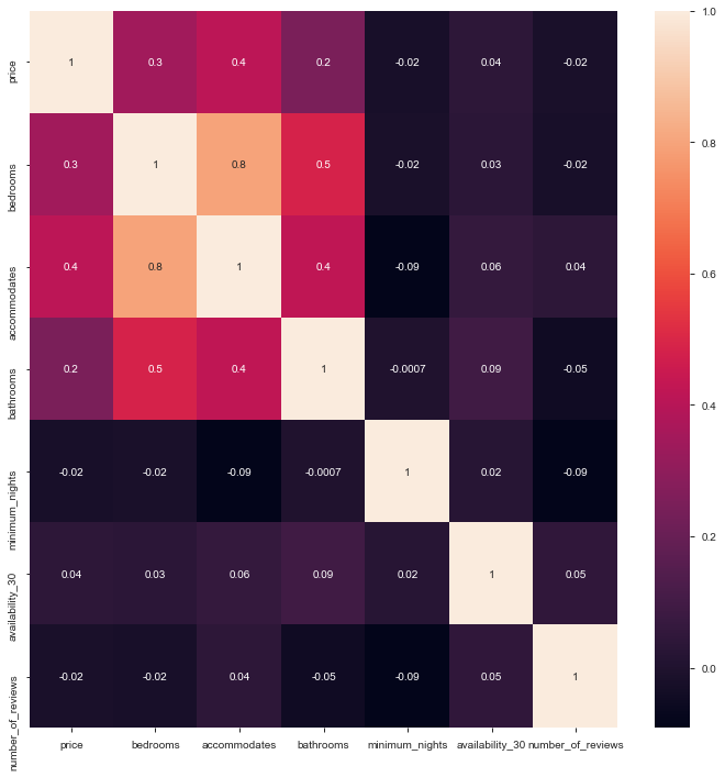
The positive correlations between price–bedrooms and price–accommodates make sense: a property with more bedrooms should be larger, and a larger property is mostly more expensive. The same applies to accommodates and bathrooms. One problem with these conclusions: the neighborhood isn’t part of the calculation. A smaller apartment in a high-paying area will likely have fewer bedrooms and accommodate fewer people.
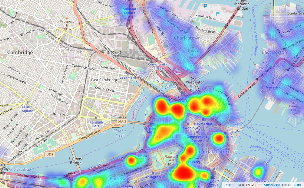
To solve that, we look deeper into the price differences between neighborhoods. I created a heatmap with folium — you need the latitude, longitude, and a parameter to visualize. In this case the maximum price:
import folium
from folium.plugins import HeatMap

# the max price will be used as indicator for the color of the heatmap
max_amount = float(boston_df['price'].max())
hmap = folium.Map(location=[42.36, -71.05], zoom_start=12)
hm_wide = HeatMap(
    list(zip(boston_df.latitude.values,
             boston_df.longitude.values,
             boston_df.price.values)),
    min_opacity=0.2,
    max_val=max_amount,
    radius=17, blur=15,
    max_zoom=1,
)
hmap.add_child(hm_wide)
As the map shows, the most expensive property types are serviced apartments, condos and boats. A regular apartment is the most frequently listed property type after houses — both have a mean price below $250.
2. Do public holidays or seasonality influence the price?
Next we want to see whether the date influences the price.
To answer this, we group the listing data by day, month and year, and plot the findings with a simple bar chart.
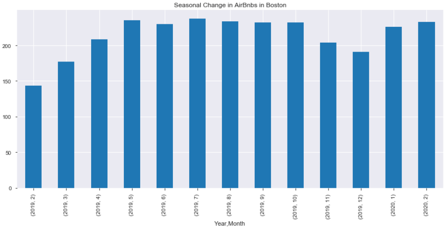
The chart shows seasonality in the winter months: in February, March and December 2019, the average price was below $200. The average price starts to rise in January and February.
For the second part of the question — the influence of public holidays — we use the holidays package.
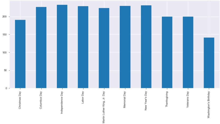
Prices around most holidays are above $200, except Christmas, which sits at about $190. The only real outlier is Washington’s Birthday, with an average price of $140.
3. Is it possible to predict the price of an Airbnb?
With the last question we move further along the CRISP-DM process: the first question covered business and data understanding, the second went deeper into data understanding and data preparation. Now it’s time for modeling and more data cleanup.
First we use pandas get_dummies to one-hot encode the categorical data into numerical values for modeling. Then we split the data with scikit-learn’s train_test_split — 80% training, 20% test. As a performance metric I use the MAE, which gives a good overview of how far on average we are from the target.
For modeling we create a simple linear regression model with a DecisionTreeRegressor:
from sklearn import tree
from sklearn import metrics

dectree = tree.DecisionTreeRegressor(max_depth=5, random_state=0)
dectree = dectree.fit(X_train, y_train)

tree_err = metrics.median_absolute_error(y_test, dectree.predict(X_test))
We get an MAE of 44.2 — an average difference of $44.
Conclusion
A brief summary of the findings:
- Airbnbs around the harbor or water in Boston are more expensive than accommodations farther away from the water.
- The more bathrooms, bedrooms and people an Airbnb can house, the more it costs.
- It’s possible to create a model without much preprocessing and feature selection that comes pretty close to the cost of an Airbnb.
The code and more graphs are in the Jupyter notebook on GitHub. Get the data from Inside Airbnb.
Cover image by Osman Rana on Unsplash.